Welland’s Brand Story
A revitalized brand identity offers a community many benefits, including an enhanced tourism and investment industry that attracts consumers and sustainably nurtures economic growth. In Welland, it’s a chance to tell people who we are, what we believe, and what makes the City of Welland Niagara’s premier destination to live, work, play, and invest.
What shaped the brand?
Digital survey
responses
One-on-one
interviews
Focus groups sessions
Through feedback and conversations, there were select personality traits and specific differentiators people referred to most when speaking of the City of Welland.
Personality traits
- resilient
- ambitious
- growing
- family-oriented
- historic
- friendly
- relaxed
- welcoming
- unique
- authentic
Differentiators
- recreational canal
- parks, trails, and green space
- preserved sense of community and small-town feel
- accessibility
- industrial heritage
- diversity and Francophone community
Brand story
Traverse the iconic canal that bisects the Niagara Peninsula and you’ll find Welland: an emerging city abundant in exciting recreational opportunities, scenic greenspace, and a thriving arts and culture scene — all within close proximity of two Great Lakes, Toronto, and the USA. The fingerprint of the City’s industrious past exhibits itself in a palpable sense of resilience, whether amongst the steadfast residents who call Welland home, or the ambitious businesses who are unified in making it an exciting place to be. Regardless of age or stage of life, Welland’s outdoor activities, festivals and events, restaurants and retailers, and community-minded spirit make it an unforgettable place to raise a family, make a memory, or nurture a new idea.
Brand positioning
Welland is an ambitious and unique waterfront city enlivened by residents, enriched by businesses, and enhanced by the tourists who follow their curiosity here. A resilient spirit permeates every corner of the city, while 44 kilometres of recreational waterway lends itself to adventure and reverie. With Lake Ontario to the north, Lake Erie to the south, the Greater Toronto Area 90 minutes away, and the USA accessible in under 40 minutes, Welland is ideally situated for growth and opportunity — readily welcoming all who seek big city amenities complemented by a preserved small town feel.
Brand mission
To spark curiosity and reflect a welcoming community that’s rich in opportunity.
Values
Community
We strive to build connections within the community and to demonstrate a warmth of spirit that’s both felt and remembered.
Resilience
We embrace opportunities to evolve beyond our industrious past, and charge into the future with a sense of optimism and purpose.
Ambition
We problem solve and pursue innovation with grit and determination.
Friendliness
We see neighbours as family and tourists as friends and readily seize opportunities to extend kindness and goodwill their way.
Rationale
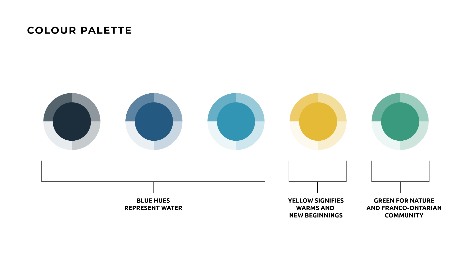
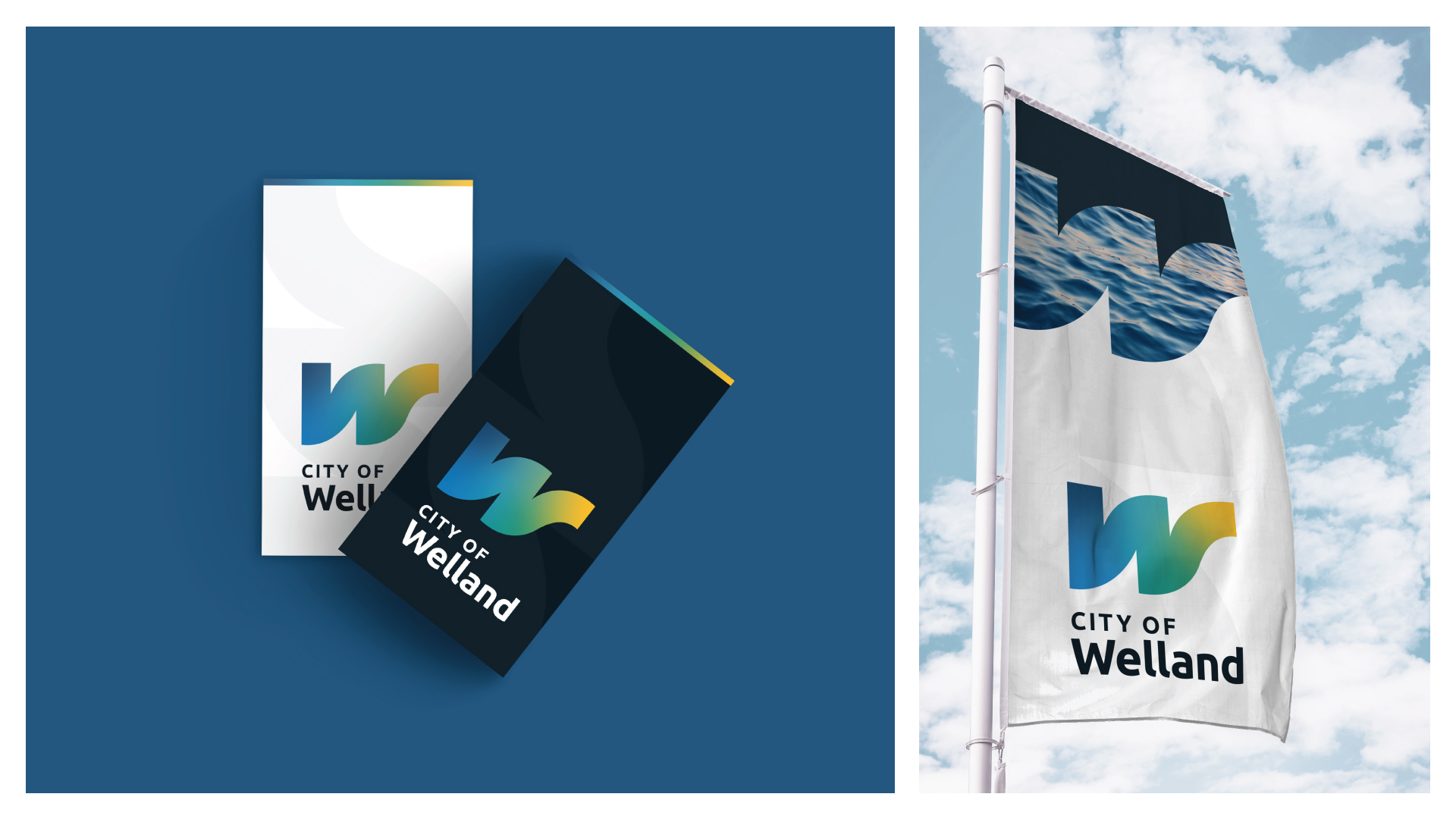
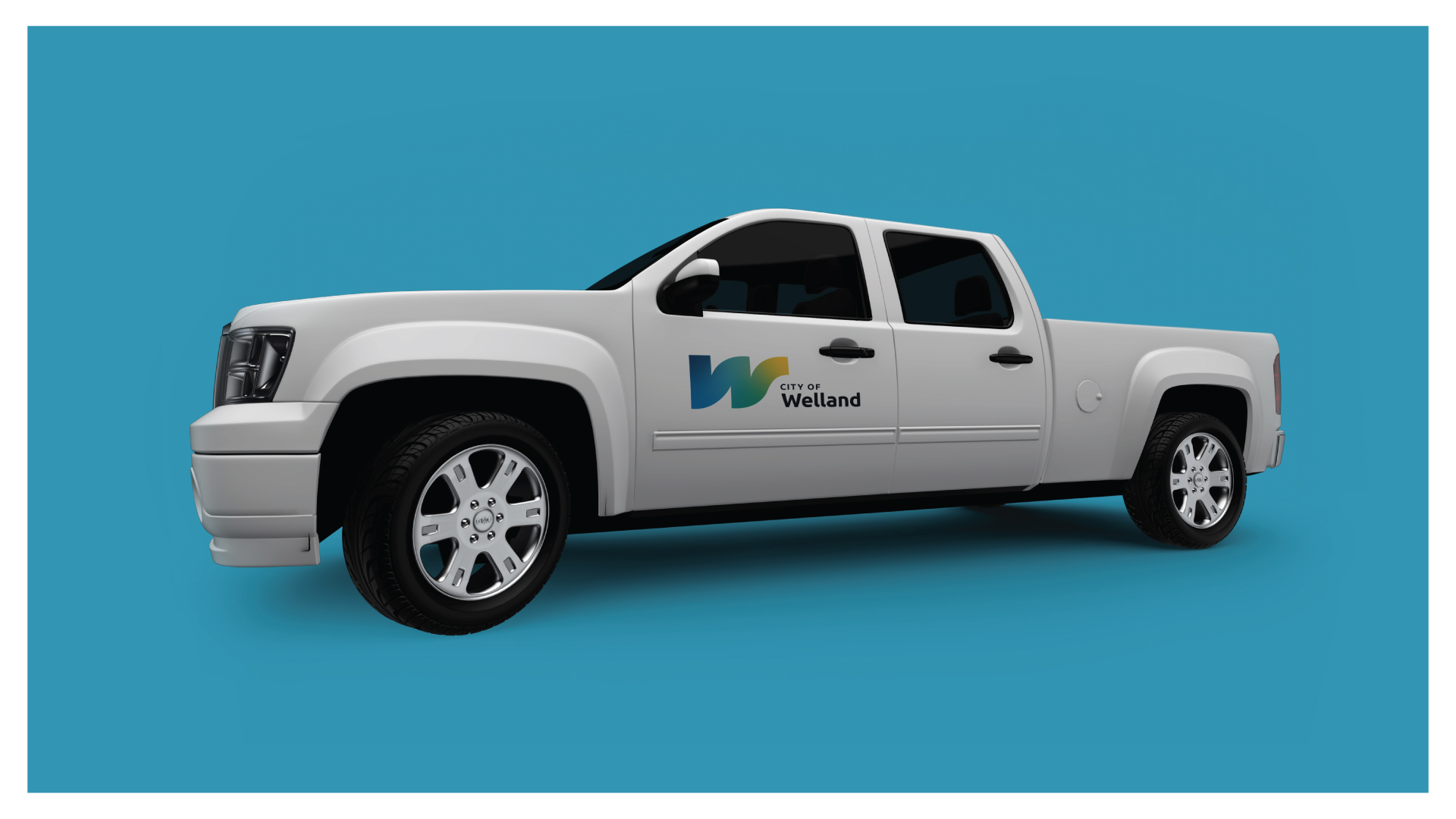
Courtesy the canal that carves its way through the City, this logo concept’s bold ‘W’ shape reflects the fluidity of water, connection between communities, and the theory of movement and constant evolution. As an adaptive logo in which imagery from within the community can be displayed, this concept paves the way for authenticity and intrigue amongst residents and visitors alike.
Why did the City of Welland rebrand?
You could say we didn’t rebrand; we actually created a brand, because prior to 2023, Welland did not have a brand — it had a logo. The previous logo was the result of a community design contest in 2017 that professionals in the graphic design industry panned as spec work. The previous logo did not undergo the same research, comparative analysis, or design standards criteria that a corporate logo/brand should endure before application.
A revitalized brand identity offers our community many benefits, including an enhanced tourism and investment industry that attracts consumers and sustainably nurtures economic growth. Additionally, a revitalized brand identity:
- differentiates a community from competing/nearby towns and cities
- forges strong emotional connections with audiences
- displays a community's distinct assets and exciting experiences
- sparks curiosity in tourists; increases the number and length of visits
- helps attract repeat visits to businesses and drive investment to the area
- facilitates renewed civic pride/ambassadorship in residents and attracts new families to the area
- provides an effective and polished platform from which to mobilize marketing activities and ongoing campaigns
Read the staff reports:
How do you determine value from rebranding?
Quantifying the value of a brand, especially a place brand, is incredibly difficult. There is no immediate economic or monetary figure you can attach to it. It will take time for the new brand to resonate within the community and beyond. But the brand will show its value in how people think, speak, and experience the City of Welland. Are conversations about Welland more favourable than they’ve been in the past? Are people excited to come back and experience more of what the City has to offer? If yes, the brand is working.
How much did you spend on rebranding?
Staff cannot determine the final cost to rebranding until 2027, when the brand phase-in is complete. To date, the consultation and brand creation cost $65,000. The brand creation included research, consultation, concept design, photography, videography, print and digital asset templates, swag templates and designs, and the collaboration of an entire team. In the 2023 capital budget, there is an additional $50,000 to rebrand the City's fleet, promotional materials such as event tents, banners, and highly visible assets. In addition, park signs, road signs, and other items are to be considered in future budgets and replaced as they reach their end of service.
Who created the brand?
The City’s new brand was created by Cinnamon Toast New Media Inc., an award-winning agency that has done dozens of municipal place branding projects. Cinnamon Toast was chosen as part of a competitive bid process, and approved by Welland City Council on April 5, 2022.
How did you arrive at this brand concept?
Members of Cinnamon Toast conducted an exhaustive research phase for the project. A public survey on EngageWelland was open to staff, residents, and stakeholders. Additionally, Cinnamon Toast conducted one-on-one interviews and focus groups to understand where the community felt the city was headed and what was important to include in the brand's representation. These results determined that authenticity, friendliness, resiliency, and uniqueness were all critical factors to consider. The canal and inclusivity were the most important aspects of how the city should reflect the brand, and the logo's fluidity and colours accurately represent these ideas.
So, our brand is just a W?
A brand is not a logo, and a logo is not a brand. So, what does our logo represent?
Courtesy of the canal that carves its way through the city, this logo concept's bold 'W' shape reflects the fluidity of water and waves, the connection between communities, and the theory of movement and constant evolution. As an adaptive logo in which imagery from within the community can be displayed, this concept paves the way for authenticity and intrigue amongst residents and visitors alike.
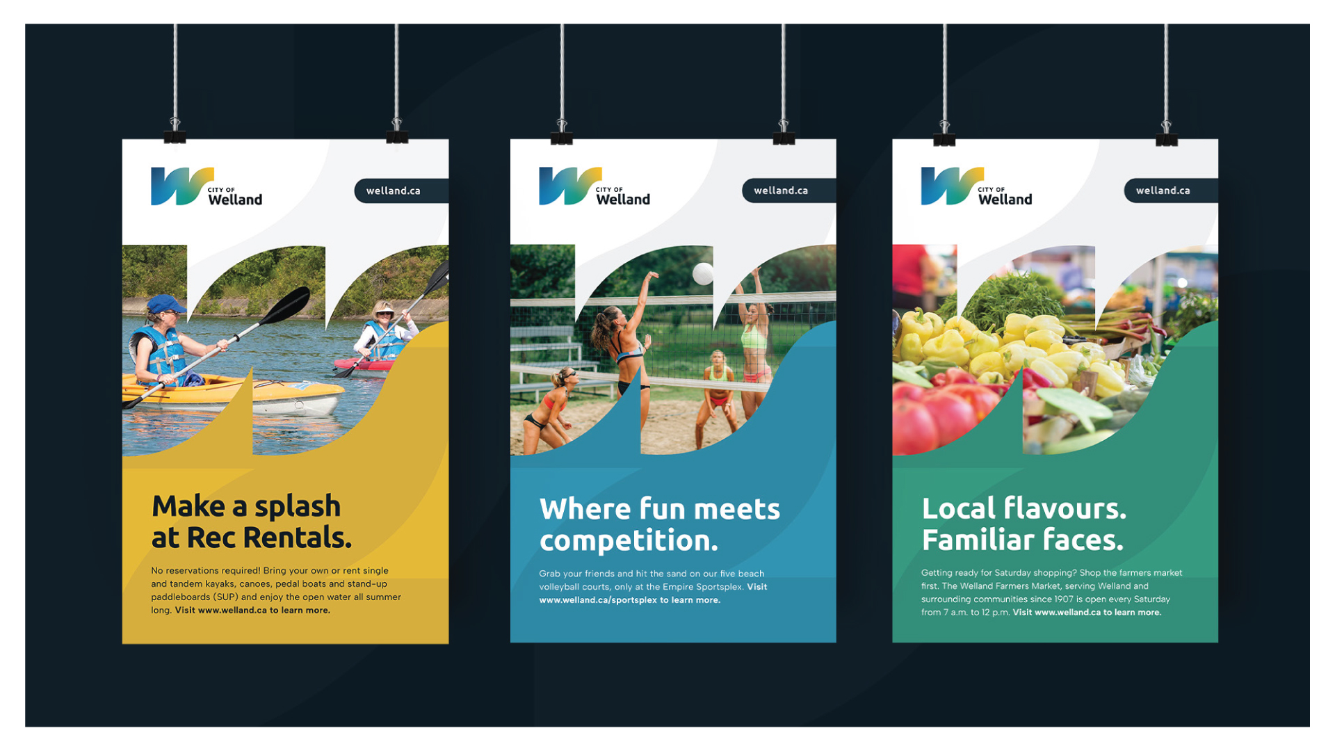
Overall, the brand is designed to:
- highlight the unique nature of the recreational canal, pathways, green spaces, and parks
- focus on sports, activity, and recreation, and represent this in a way that is accessible to every demographic
- include themes of connection, both in a physical sense within the City and region, and from a relational perspective
- include themes of resiliency and convey a sense of opportunity
- highlight the time of transformation and self-discovery that Welland is currently experiencing
- evoke the strong sense of community felt among residents
The logo, the imagery, the stories, the text, the position — these are all parts that create the sum.
What if I don’t like the logo?
That’s OK if you don’t — not everyone will. But rest assured, just as you may see a building you don’t think is attractive, it was designed by industry professionals according to best practices, industry standards, and field expertise.
In other words, logos, as with all visuals, are subjective. They are assigned meaning by the stories we tell about them and the places they represent, which means residents have a meaningful role to play in how this logo is interpreted, understood, and embraced by those who will encounter it.
Contact
- Communications
- Civic Square,
60 East Main St., Welland, ON L3B 3X4 - 905-735-1700 x2337
- communications@welland.ca
- /cityofwelland
- /welland